Traditional architectural styles provide a lot of detail for the eye. A common paradigm is that a building has three scales of detail: the overall shape (or "form" as architects insist on calling it), large detail, and small detail. The idea is that the building's shape can be read at the limits of vision, the large detail can be read from a distance, and the small detail provides scale when at close range.
A traditional example, 17th-century St. Paul's in London:

A modern example, the 1929 Chrysler Building in NYC:

Closer, you see the black-and-white brick patterning and more details of the windows:

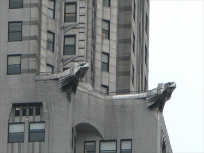
At very close range you see details of the brick and gargoyles:
and even seams in the stainless steel skin:

So if both traditional and modernist architecture give us multiple scales, what's the issue? Several types of modernism, most notably International-Style Modernism, tried to get rid of detail.
The 1958 Seagram Building in NYC

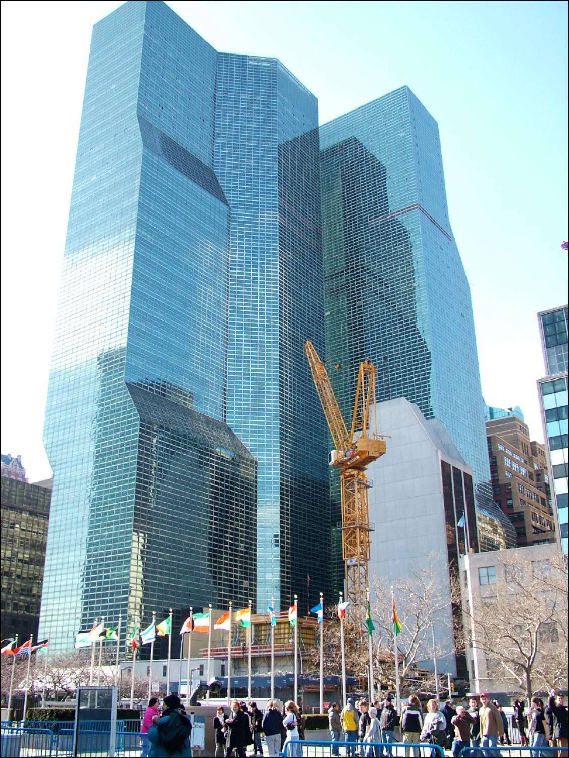
More recent examples are even more scaleless (less scaleful?). The two 1970s UNDC buildings in NYC, across the street from the UN, have nothing to relate their size to a viewer:
The problem with "glass boxes" isn't that they're sheathed in glass or that they have boxy shapes. The problem is they do not relate to human scale because they have too little detail. I've never heard anyone say they felt the Chrysler Building is too big, even though it's noticeably larger than the UNDC buildings.
Blame Mies if you want, blame Adolf "Ornament is Crime" Loos, but most of all blame developers who seized on an architectural philosophy of simplicity and use it to justify cheapness.
11 comments:
Can I blame engineers who have always wanted to eliminate architects from the construction process?
Even those of us without scrotal piercings?
Not really, since engineers don't care if there's ornament or not.
(Those who see actual little people, whether leprechauns or elves, are outside the scope of this blog.)
There goes your Icelandic readership!
Not really, since engineers don't care if there's ornament or not.
But they HAVE always wanted to eliminate architects.
I'm okay with the glass boxes to an extent. It's the street-life killing plazas I hate.
A weird thing about the glass boxes is the grim tinting. Here we flatter ourselves that we have nice stuff to look at and our buildings are often greenish glassy: you can see in and out. The black towers seem like nasty prisons.
The greenish ones are for living in obviously, but still...
I am usually opposed to reflective and tinted glazing. There's a muni building in Milwaukee that has grey tint, and no matter how beautiful the day is, it seems grey and miserable from the inside. The plan examiners got much more friendly when they got moved out. The inspectors are still there, which explains much, I think...
However, having just visited the southwest, I see the need for reflective glazing in some cases.
I like some glassy towers, but S McG Johnson is right in that part of their success is in an active, inviting and engaging street presence, which designers like Helmut Jahn have kind of sucked at. I had to redesign one of his plazas once because wind pressure through the atrium sucked the water right through all the doors.
The part that bothers me about high rise architecture is the effect on the microclimate. Winds become terrifying.
If wine boxes were reflective, would Ann Althouse be forced to examine her life?
The part that bothers me about high rise architecture is the effect on the microclimate. Winds become terrifying.
Interestingly, the cure for this problem is the same as the cure for light and air blockage: set-backs. NYC's 1916 zoning law demanded set-backs and the downdrafts that are endemic with tall buildings hit the set-back roof. The 1960 zoning law fucked it all up with plazas and no set-backs, so there's a nice comparison as you walk down the street.
engineers [...] have always wanted to eliminate architects from the construction process
Too many of them and the concrete loses its compressive strength.
(Those who see actual little people, whether leprechauns or elves, are outside the scope of this blog.)
There goes your Icelandic readership!
Also the readers with Charles Bonnet Syndrome.
Interestingly, the cure for this problem is the same as the cure for light and air blockage: set-backs. NYC's 1916 zoning law demanded set-backs and the downdrafts that are endemic with tall buildings hit the set-back roof. The 1960 zoning law fucked it all up with plazas and no set-backs, so there's a nice comparison as you walk down the street.
John Norquist and Peter Park did excellent work in re-aligning the design goals of Milwaukee when they were here, and projects are mostly designed to engage the street edge, move parking to a secondary location, and provide for pedestrian amenities (not "plazas")
Of course, we are built on a frickin swamp, not granite, and since there are fewer tall buildings, there's no requirement for stepbacks, so the downdrafts are a problem.
Plus, stepbacks are costlier to build, so glassy boxes it is!!
"Ornament is Crime"
Anal piercings should be, anyway.
Post a Comment